Color Me FACE1E55
Published 5 days ago
There’s a long history in computer programming of using hexadecimal strings that look like English words to flag errors. These are referred to, amusingly, as “magic debug values”, and yes, Wikipedia has the lowdown. One of the most (in)famous is
DEADBEEF, which was used “on IBM systems such as the RS/6000, also used in the classic Mac OS operating systems, OPENSTEP Enterprise, and the Commodore Amiga”, among others. It’s also become the name of a Gnu/Linux music player, and apparently does not have anything to do with Cult of the Dead Cow, at least not so far as I could determine. Maybe someone with more knowledge can drop a comment.
Anyway, one of the things about these magic debug values is they’re usually eight characters long. Not always, as in the case of
BADC0FFEE0DDF00D (from RS/6000, again), but usually. Nintendo used 0D15EA5E in the GameCube and Wii to indicate a normal boot (!), iOS logs DEAD10CC when an application terminates in a specific yet incorrect manner, and FEEDFACE shows up in PowerPC Mach-O binaries , as well as the VLC Player application. Just to pick a few examples.
The eight-character nature of these magic codes has meant that, for a long time, you couldn’t also use them on the sly to define colors in CSS, because it was limited to the
#RRGGBB format. Well, those days are over. Long over. Eight-digit hex color values are here, have been here a while, and are widely supported. Here are a few swatches laid over a (fully opaque) white-to-black gradient.
| #abadcafe | |
|---|---|
| #baaaaaaa | |
| #deadbeef | |
| #deadfeed | |
| #defec8ed | |
| #feedbacc |
If you’re using Internet Explorer or Edge, those aren’t going to work for you. At least, not until Edge switches over to Blink; then, they should work just fine.
Thanks to the way they were constructed, by only using the letters A-F, most of the colors above are mostly opaque. The last two digits in
#RRGGBBAA set the alpha channel level of the color, just like the last part of the rgba() syntax. Thus, the EF at the end of DEADBEEF sets the alpha value to 0.937; EF is equivalent to decimal 239, and 239 ÷ 255 = 0.937 (approximately). In other words, #DEADBEEF is essentially equivalent to rgba(222,173,190,0.937).
That’s why, of the six swatches, only the sheepish
#baaaaaaa and the homophonic #feedbacc let the background gradient show through more than very slightly; their alpha channels are 0.666 and 0.8, respectively. The rest are 0.929 and up.
Being stuck in the A-F range is fairly constraining, but that’s where hexadecimal and English overlap, so that’s how it goes. However, if you’re willing to turn to leetspeak syntax—that is, allowing yourself to use
0 as a substitute for O, 1 for L and occasionally I, 5 for S, 7 for T, and so on—then a lot more possibilities open up. In addition to some of the classic error codes like fee1dead (Linux), I had fun devising other eight-character color words like acc0lade and face1e55, not to mention the very nautical ccccccc5. (Think about it.) Behold!
| #0ff1c1a1 | |
|---|---|
| #1337c0de | |
| #5e1f1e55 | |
| #a114c0de | |
| #acc01ade | |
| #ba5e1e55 | |
| #bada55e5 | |
| #bebada55 | |
| #beefc0de | |
| #b0bafe77 | |
| #b0a710ad | |
| #c010ca7e | |
| #c0de1e55 | |
| #ccccccc5 | |
| #d0d0code | |
| #dabbad00 | |
| #dead10ad | |
| #deadd0d0 | |
| #decea5ed | |
| #face1e55 | |
| #fee1dead |
There are still more l33t-compliant number substitutions available, like
6 for G, but I felt like I was already pushing it with the examples I have. One could also use calculator spelling, where 9 is a stand-in for g, and even mix together l33t and calculator syntaxes in the same value. So many possibilities!
You may have noticed one value which creates no color:
#DABBAD00, which has 00 for its alpha, so it’s fully, completely transparent. It’s fully transparent #DABBAD, I suppose, but there’s really no difference between one transparent color and another, as far as I’m concerned. I mean, if a color falls transparent, then there’s nobody to see it, so is it really a color at all? I say thee nay.
If you’re familiar with the way
#RRGGBB hex values can be represented with the shortened #RGB syntax, then it will probably come as little surprise that #RRGGBBAA has a shortened #RGBA syntax, where each digit is duplicated. This opens the world of four-letter words to us! Here are a few:
| #10ad | |
|---|---|
| #1337 | |
| #b007 | |
| #ba5e | |
| #bead | |
| #beef | |
| #c0de | |
| #cafe | |
| #cede | |
| #dada | |
| #dead | |
| #deed | |
| #f00d | |
| #fade | |
| #f8ed | |
| #feed | |
| #0b0e |
Here, we finally have a fully opaque word-color:
#BEEF expands out to #BBEEEEFF, making the alpha value FF, which decimal-translates to 255, which is fully opaque. So we get a nice opaque powdery blue out of BEEF, which is counterintuitive in the best possible way. Also, every time I see BBEEEEFF, either in print or in my head, I hear Mrs. Which ordering dinner.
And okay, yes,
#F8ED isn’t a four-letter word, it’s a four-symbol license-plate word. So it’s even cooler.
If you’re thinking about using these in your CSS, you might be concerned about backwards compatibility, since any browser that doesn’t understand four- or eight-digit hexadecimal color values will just drop them on the floor. That might be okay for text coloring, since the text will likely have some color, even if it’s browser-default, which is usually black. For backgrounds, having colors ignored probably less okay, particularly if you set foreground colors that depend on the background colors.
There are a couple of possibilities here. One is to use the cascade and CSS error handling to your advantage, in the time-honored pattern of doing the simpler version first and the more sophisticated version second.
#example {
   color: #DEA;
   color: #DEAD;
}
That works in simple scenarios, but for more complicated situations—say, ones where you have foreground and background depending on each other—feature queries are an option to consider, if for no other reason than cleaner organization and legibility.
#example {
   color: red;
   background: #EEE;
}

@supports (color: #ABCD) {
   #example {
      color: #f00d;
      background: #feed;
   }
}
Naturally and as usual, you’ll have to figure out what makes the most sense for your situation. Maybe the right answer will be to avoid using these sorts of values at all, although I don’t know where the fun is in that.
At any rate, I hope you’ve enjoyed this little tour of magic debug values, l33tspeak, and color words. As always,
#feedbacc is more than welcome in the comments!
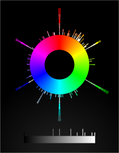
CSS4 Color Keyword Distribution Visualization
Published 1 week, 1 day ago
Long, long ago—not quite seven years ago, in fact—I built a canvas-based visualization of the distribution of CSS3/SVG color keywords and released it. And there it’s sat, static and inert (despite being drawn with a whooooole lotta JS) ever since.
I’ve always meant to get back to it and make it more interactive. So over the past several evenings, I’ve rebuilt it as an SVG-based visualization. The main point of doing this was so that when you hover the mouse pointer over one of the little color boxes, it will fill the center of the color wheel with the hovered color and tell you its name and HSL values. Which it does, now. It even tries to guess whether the text should be white or black, in order to contrast with the underlying color. Current success rate on that is about 90%, I think. Calculating perceived visual brightness turns out to be pretty hard!
Other things I either discovered, or want to do better in the future:
- Very nearly half the CSS4 (and also CSS3/SVG) color keywords are in the first 90 degrees of hue. More than half are in the first 120 degrees.
- There are a lot of light/medium/dark variant names in the green and blue areas of the color space.
- I wish I could make the color swatches bigger, but when I do that the adjacent swatches overlap each other and one of them gets obscured.
- Therefore, being able to zoom in on parts of the visualization is high on my priority list. All I need is a bit of event monitoring and some viewbox manipulation. Well, that and a bit more time. Done, at least for mouse scroll wheels.
- I’d like to add a feature at some point where you type text, and a list is dynamically filtered to show keywords containing what you typed. And each such keyword has a line connecting it to the actual color swatch in the visualization. I have some ideas for how to make that work.
- I’d love to create a visualization that placed the color swatches in a 3D cylindrical space summarizing hue, lightness. and saturation. Not this week, though.
- I’m almost certain it needs accessibility work, which is also high on my priority list.
- SVG needs conic gradients. Or the ability to wrap a linear gradient along/inside/around a shape like a circle, that would work too. Having to build a conic gradient out of 360 individual
<path>s is faintly ridiculous, even if you can automate it with JS. - And also
z-indexawareness. C’mon, SVG, get it together.
Anyway, here it is: CSS4 Color Keyword Distribution. I hope you like it!
“Stacked ‘Borders’” Published at CSS-Tricks
Published 2 weeks, 4 days agoI toyed with the idea of nesting elements with borders and some negative margins to pull one border on top of another, or nesting a border inside an outline and then using negative margins to keep from throwing off the layout. But none of that felt satisfying.It turns out there are a number of tricks to create the effect of stacking one border atop another by combining a border with some other CSS effects, or even without actually requiring the use of any borders at all. Let’s explore, shall we?
That’s from the introduction to my article “Stacked ‘Borders’”, which marks the first time I’ve ever been published at the venerable upstart CSS-Tricks. (I’m old, so I can call things both venerable and an upstart. You kids today!) In it, I explore ways to simulate the effect of stacking multiple element borders atop on another, including combining box shadows and outlines, borders and backgrounds, and even using border images, which have a much wider support base than you might have realized.
And yes, as per my usual, the images in the piece are all double-dpi :screenshot captures directly from Firefox.
Many thanks to Chris Coyier for accepting the piece, and Geoff Graham for his editorial assistance. I hope you’ll find at least some part of it useful, or better still, interesting. Share and enjoy!
Legend of the Stalwart Mouse: Return of the MX518
Published 2 weeks, 5 days ago
I’ve relied on a mouse for about a decade and a half. I don’t mean “relied on a mouse” in the generic sense, but rather in the sense that I’ve relied on one very specific and venerable mouse: a Logitech MX500.
I’ve had it for so long, I’d forgotten how long I’ve had it. I searched for information about its production dates and wouldn’t you know it, Wikipedia has an article devoted solely to Logitech products throughout history, because of course it does, and it lists (among other things) their dates of release. The MX500 was released in 2002, and superseded by the MX510 in 2004. I then remembered a photo I took of my eldest child when she was an infant, trying to chew on a computer mouse. I dug it out of my iPhoto library and yep, it’s my MX500. The picture is dated June 2004.
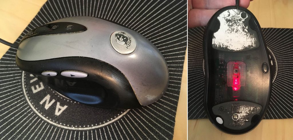
So I have photographic evidence that I’ve used this specific mouse for 15 years or more. The logo plate on top of the mouse has been worn half-smooth and half-paintless by the palm of my hand, much like the shiny-smooth areas worn into the subtle matte surface texture where the thumb and pinky finger grip the sides. The model and technical information printed on the underside has similarly worn away. It started out with four little oval glide nubs on the underside that held the bottom away from the desk surface; only one remains. Even though, as an optical mouse, it can be used on any surface, I eventually went back to soft mousepads, so as to limit further undercarriage damage.
Why have I been so devoted to this mouse? Well, it’s incredibly well engineered, for one—it’s put up with 15 years of daily use. It’s exactly the right shape for my hand, and it has multiple configurable inputs right where I expect them. There are arrow buttons just above my thumb which I use as forward/backward in browsers, buttons above and below the scroll wheel that I map to Page Up/Page Down, an extra button at almost the apex of the mouse’s back mapped to ⌥⇥ (Option-Tab), and the usual right/left mouse click buttons. Plus the scroll wheel is itself a push-down-to-click button.
Most of these features can be found on one mouse or another, but it’s rare to find them all in one mouse—and next to impossible to find them in a shape and size that feels comfortable to me. I’d occasionally looked at the secondary market, but even used, the MX500 can command three figures. I checked Amazon as I wrote this, and an unused MX500 was listing for two hundred fifty dollars. Unused copies of its successor, the MX510, were selling for even more.
Now, if you were into gaming in the first decade of the 2000s, you may have heard of or used the MX510’s successor, the MX518. Released in 2005, it was basically an MX500/MX510, but branded for gaming, with some optical-sensor upgrades for more tracking precision. The MX518 lasted until 2011, when it was superseded by a different model, which itself was superseded, which et cetera, et cereta, et cetera.
Which brings me to the point of all this. A few weeks ago, after several weeks of sporadic glitches, the scroll wheel on my MX500 almost completely stopped responding to being scrolled. Which maybe doesn’t sound like a big deal, but try going without your scroll wheel for a while. I was surprised to discover how much I relied on it. So, glumly, knowing the model was long out of production and incredibly expensive to buy, I went searching for equivalents.
And that’s when I discovered that Logitech had literally announced less than a week earlier that they were releasing an updated MX518, available for pre-order.
Friends, I have never pre-ordered anything so fast.
This past Thursday afternoon, it arrived. I got it set up and have been working with it since. And I have some impressions.
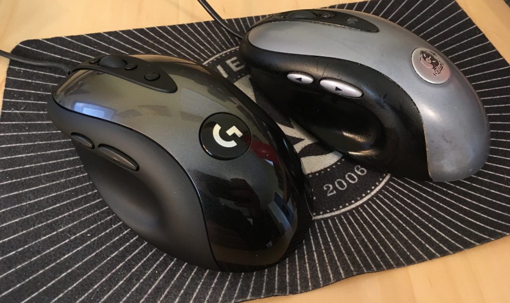
Physically, the MX518 Legendary (as Logitech has branded it) is 95% a match for my old MX500. It’s ever so slightly smaller, just enough that I can tell but not quite enough to be annoying, odd as that may seem. Otherwise, everything feels like it should. The buttons are crisp and clicky, and right where I expect them. And the scroll wheel… well, it works.
The coloration is different—the surface and buttons are all black, as opposed to the MX500’s black-and-silver two-tone styling. While I miss the two-tone a bit, there’s an upgrade: the smooth black top surface has subtle little sparkles embedded in the paint. Shiny!
On the other hand, configuring the mouse was a bit of an odyssey. First off, let me make clear that I have a weird setup, even for a grumpy old Mac user. I plug a circa-2000 Macally original iKey 104-key keyboard into my 2013 MacBook Pro. (Yes, you have sensed a trend here: when I find hardware I really like, I hang onto it like a rabid weasel. Ditto software.) The “extra” keys on the Macally like Page Up, Home, and so on don’t get recognized by a lot of current software. Even the Finder can’t read the keyboard’s function keys properly. I’ve restored their functionality with the entirely excellent BetterTouchTool, but it remains that the keyboard is just odd in its ancientness.
Anyway, I first opened System Preferences and then the Logitech Control Center pane. It couldn’t find the MX518 Legendary at all. So next I opened the (separate) Logitech Options pane, which drives the wireless mouse I use when I travel. It too was unable to find the MX518.
Some Bing-ing led me to a download for Logitech Gaming Software (hereafter LGS), which I installed. That could see the MX518 just fine. Once I stumbled my way into an understanding of LGS’s UI, I set about trying to configure the MX518’s buttons to do what I wanted.
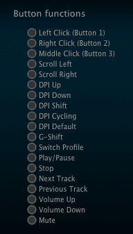
And could not. In the list of predefined mouse actions that could be assigned to the buttons, precisely none of my desires were listed. No ⌘-arrow combos, no page up or down, not even ⌥⇥ to switch apps. I mean, I guess that’s to be expected: it’s sold as a gaming mouse. LGS has plenty of support for on-the-fly-dee-pee-eye switching and copy-paste and all that. Not so much for document editing and code browsing.
There is a way to assign keyboard combos to buttons, but again, the software could understand precisely none of the combos I wanted to record when I typed them on my Macally. So I went to the MacBook Pro’s built-in keyboard, where I was able to register ⌥⇥, ⌘→, and ⌘←. I could not, however much I tried, register Page Up or Page Down. I pressed Fn, which showed “Fn” in the LGS software, and then pressed the down arrow for Page Down, and as long as I held down both keys, it showed “Page Down”. But as soon as I let go of the down arrow, “Fn” was registered again. No Page Down for me.
Now, recall, this was happening on the laptop’s built-in keyboard. I can’t really blame this one on age of the external Macally. I really think this one might fall on LGS itself; while a 2013 MacBook is old, it’s not that old.
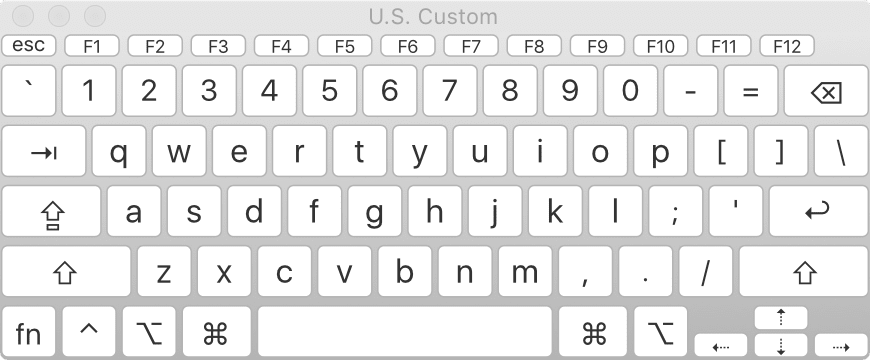
I thought I might be stuck, but I intuited a workaround: I opened the Keyboard Viewer app built into the Finder. With that, I could just click the virtual Page Up and Page Down keys, and LGS registered them without a hiccup. While I was in there, I used it to set the scroll wheel’s middle-button click to trigger Mission Control (F3).
The following key-repeat problem has been fixed and was not the fault of the MX518; see my comment for details on how I resolved it. The one letdown I have is that the buttons don’t appear to repeat keystrokes. So if I hold the button I’ve assigned to Page Down for example, I get exactly one page-down, and that’s it until I release and click the button again. On the MX500, holding down the button assigned to Page Down would just constantly page down until I let go. This was sometimes preferable to scrolling with the scroll wheel, especially for long documents I wanted to very quickly scan for a certain figure or other piece of the page. The same was true for all the buttons: hold it down, and the thing it was configured to do happened repeatedly until you let go.
The other annoyance is one of possibly missed potential. The mouse software has, in keeping with its gaming focus, the ability to set up multiple profiles; that way, you can assign unique actions to the buttons on a per-application basis. I set up a couple of profiles to test it out, but LGS is completely opaque about how to make profiles switch automatically when you switch to an app. I’ll look for an answer online, but it’s annoying that the software promises per-app profiles, and then apparently fails to deliver on that promise.
So after all that, am I happy? Yes. It’s essentially my old mouse, except brand new. My heartfelt thanks to Logitech for bringing this workhorse out of retirement. I look forward to a decade or more with it.
Breaking Silence
Published 3 weeks, 1 day ago
So it’s been (checks watch) half a year since I last blogged, yeah, okay, been a while. I took a break, not that you would’ve been able to tell from the sporadic nature of updates before I did so, but a break I took nonetheless. Well, break’s over.
One of things I plan to do is fill in a post I missed writing at the beginning of December: the 25th anniversary of my working with the web. I’ll tell the story in that post, but suffice to say it involves a laptop, a printout of the HTML specification, Microsoft Word 5.1a, a snagged Usenet post, and Mystery Science Theater 3000. Keep circulating the tags!
Before that happens, I’ll be posting a review of the return of a very old, very faithful assistant. I also have an article coming on a site where I’ve never been published before, so that’s exciting—look for an announcement here as soon as it’s public. Stay tuned!
Variable Font Support
Published 7 months ago
Firefox 62 ships today, bringing with it some real CSS goodness. For one: float shapes! Which means now, mainline Firefox users will see the text flow past the blender in “Handiwork” the same way Chrome users have for a long time now.
But an even bigger addition is support for variable fonts. The ability to have one font file that mathematically describes variants on the base face means that all kinds of fine-grained typography is possible with far less bandwidth overhead and a major reduction in page weight.
However: bear in mind that like Safari, but unlike Chrome, Firefox’s variable-font support is dependent on the operating system on which is runs. If you have Windows 10, or Max OS X 10.13, then you have variable font support in Firefox and Safari. Earlier versions of those operating systems don’t support variable fonts, and so Safari and Firefox don’t either. Chrome rolls its own variable-font support, so it can extend support backwards in the OS timeline.
(I don’t know how things stand in the Linux world. Hopefully someone can clear things up in the comments!)
I say this not to chastise Firefox (nor Safari), because I tend to think leaning on the OS for this sort of thing is reasonable. I feel the same way about form elements like
<select> dropdowns, to be clear, which I know likely places me in the minority. The point here is to give you a heads-up: if you get reports that a font isn’t doing the variable thing you styled, but it’s working fine for you, keep “check their operating system version” on your list of diagnostic tests.Firefox’s :screenshot command
Published 7 months, 1 week ago
Back in 2015, I wrote about Firefox’s screenshot utility, which used to be a command in the GCLI. Well, the GCLI is gone now, but the coders at Mozilla have brought command-line screenshotting back with :screenshot, currently available in Firefox Nightly and Firefox Dev Edition. It’s available in the Web Console (⌥⌘K or Tools → Web Developer → Console).
Once you’re in the Web Console, you can type :sc and then hit Tab to autocomplete :screenshot. From there, everything is the same as I wrote in 2015, with the exception that the --imgur and --chrome options no longer exist. There are plans to add uploading to Firefox Screenshots as a replacement for the old Imgur option, but as of this writing, that’s still in the future.
So the list of :screenshot options as of late August 2018 is:
- --clipboard
- Copies the image to your OS clipboard for pasting into other programs. Prevents saving to a file unless you use the --file option to force file-writing.
- --delay
- The time in seconds to wait before taking the screenshot; handy if you want to pop open a menu or invoke a hover state for the screenshot. You can use any number, not just integers.
- --dpr
- The Device Pixel Ratio (DPR) of the captured image. Values above 1 yield “zoomed-in” images; values below 1 create “zoomed-out“ results. See the original article for more details.
- --fullpage
- Captures the entire page, not just the portion of the page visible in the browser’s viewport. For unusually long (or wide) pages, this can cause problems like crashing, not capturing all of the page, or just failing to capture anything at all.
- --selector
- Accepts a CSS selector and captures only that element and its descendants.
- --file
- When true, forces writing of the captured image to a file, even if --clipboard is also being used. Setting this to false doesn’t seem to have any effect.
- --filename
- Allows you to set a filename rather than accept the default. Explicitly saying --filename seems to be optional; I find that writing simply :screenshot test yields a file called test.png, without the need to write :screenshot --filename test. YFFMV.
I do have one warning: if you capture an image to a filename like test.png, and then you capture to that same filename, the new image will overwrite the old image. This can bite you if you’re using the up-arrow history scroll to capture images in quick succession, and forget to change the filename for each new capture. If you don’t supply a filename, then the file’s name uses the pattern of your OS screen capture naming; e.g., Screen Shot 2018-08-23 at 16.44.41.png on my machine.
I still use :screenshot to this day, and I’m very happy to see it restored to the browser—thank you, Mozillans! You’re the best.
Securing Web Sites Made Them Less Accessible
Published 7 months, 4 weeks ago
In the middle of last month (July 2018), I found myself staring at a projector screen, waiting once again to see if Wikipedia would load. If I was lucky, the page started rendering 15-20 seconds after I sent the request. If not, it could be closer to 60 seconds, assuming the browser didn’t just time out on the connection. I saw a lot of “the server stopped responding” over the course of a few days.
It wasn’t just Wikipedia, either. CNN International had similar load times. So did Google’s main search page. Even this here site, with minimal assets to load, took a minimum of 10 seconds to start rendering. Usually longer.
In 2018? Yes. In rural Uganda, where I was improvising an introduction to web development for a class of vocational students, that’s the reality. They can have a computer lab full of Dell desktops running Windows or rows of Raspberry Pis running Ubuntu or whatever setup there is, but when satellites in geosynchronous earth orbit are your only source of internet, you wait. And wait. And wait.
I want to explain why—and far more importantly, how we’ve made that experience interminably worse and more expensive in the name of our comfort and security.
First, please consider the enormously constrained nature of satellite internet access. If you’re already familiar with this world, skip ahead a few paragraphs; but if not, permit me a brief description of the challenges.
For geosynchronous-satellite internet access, the speed of light become a factor in ping times: just having the signals propagate through a mixture of vacuum and atmosphere chews up approximately half a second of travel time over roughly 89,000 miles (~152,000km). If that all that distance were vacuum, your absolute floor for ping latency is about 506 milliseconds.
That’s just the time for the signals to make two round trips to geosynchronous orbit and back. In reality, there are the times to route the packets on either end, and the re-transmission time at the satellite itself.
But that’s not the real connection killer in most cases: packet loss is. After all, these packets are going to orbit and back. Lots of things along those long and lonely signal paths can cause the packets to get dropped. 50% packet loss is not uncommon; 80% is not unexpected.
So, you’re losing half your packets (or more), and the packets that aren’t lost have latency times around two-thirds of a second (or more). Each.
That’s reason enough to set up a local caching server. Another, even more pressing reason is that pretty much all commercial satellite connections come with data caps. Where I was, their cap was 50GB/month. Beyond that, they could either pay overages, or just not have data until the next month. So if you can locally cache URLs so that they only count against your data usage the first time they’re loaded, you do that. And someone had, for the school where I was teaching.
But there I stood anyway, hoping my requests to load simple web pages would bear fruit, and I could continue teaching basic web principles to a group of vocational students. Because Wikipedia wouldn’t cache. Google wouldn’t cache. Meyerweb wouldn’t cache. Almost nothing would cache.
Why?
HTTPS.
A local caching server, meant to speed up commonly-requested sites and reduce bandwidth usage, is a “man in the middle”. HTTPS, which by design prevents man-in-the-middle attacks, utterly breaks local caching servers. So I kept waiting and waiting for remote resources, eating into that month’s data cap with every request.
The drive to force every site on the web to HTTPS has pushed the web further away from the next billion users—not to mention a whole lot of the previous half-billion. I saw a piece that claimed, “Investing in HTTPS makes it faster, cheaper, and easier for everyone.” If you define “everyone” as people with gigabit fiber access, sure. Maybe it’s even true for most of those whose last mile is copper. But for people beyond the reach of glass and wire, every word of that claim was wrong.
If this is a surprise to you, you’re by no means alone. I hadn’t heard anything about it, so I asked a number of colleagues if they knew about the problem. Not only had they not, they all reacted the same way I did: this must not be an actual problem, or we’d have heard about it! But no.
Can we do anything? For users of up-to-date browsers, yes: service workers create a “good” man in the middle that sidesteps the HTTPS problem, so far as I understand. So if you’re serving content over HTTPS, creating a service worker should be one of your top priorities right now, even if it’s just to do straightforward local caching and nothing fancier. I haven’t gotten one up for meyerweb yet, but I will do so very soon.
That’s great for modern browsers, but not everyone has the option to be modern. Sometimes they’re constrained by old operating systems to run older browsers, ones with no service-worker support: a lab full of Windows XP machines limited to IE8, for example. Or on even older machines, running Windows 95 or other operating systems of that era. Those are most likely to be the very people who are in situations where they’re limited to satellite internet or other similarly slow services with unforgiving data caps. Even in the highly-wired world, you can still find older installs of operating systems and browsers: public libraries, to pick but one example. Securing the web literally made it less accessible to many, many people around the world.
Beyond deploying service workers and hoping those struggling to bridge the digital divide make it across, I don’t really have a solution here. I think HTTPS is probably a net positive overall, and I don’t know what we could have done better. All I know is that I saw, first-hand, the negative externality that was pushed onto people far, far away from our data centers and our thoughts.
My thanks to Tim Kadlec and Ethan Marcotte for their feedback and insight while I was drafting this post, and to Lara Hogan and Aaron Gustafson for their early assistance wth my research.
